How You Can Quickly Create a Good Pitch Deck with Canva

The short answer—templates. It's also the reason I love Canva.
Here's the final pitch deck for an imaginary business called "M Study Club." Again, I could leverage Canva's enormous library of templates and quickly customize it to my liking.
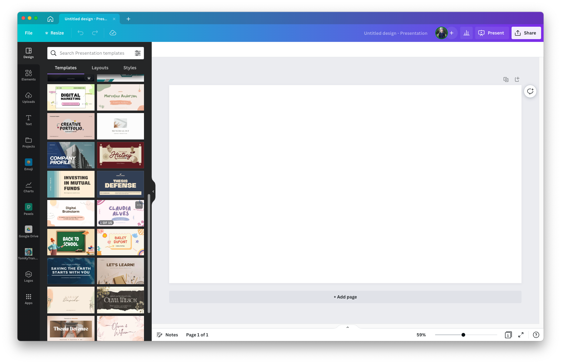
In total, it took me about 6 hours to get from an empty presentation:

To this completed pitch deck:
You might be wondering, "Is M Study Club a thing?"
It's not. But it totally should be!
The backstory for the idea in the deck
My partner is finishing his periodontics residency (gum surgery dental specialty). As a licensed dentist, you must complete continuing education courses every year to stay licensed as a periodontist/dentist.
In the dental profession, there is something called a "Study Club," and there are Study Clubs nationwide! These Study Clubs are usually led by a Periodontist (or other dental specialists such as an Orthodontist) and bring together many local general dentists for monthly advanced treatment and case discussions. It's a great way to meet other practitioners, learn advanced techniques, and make new connections.
Then, I was listening to an episode of The Crazy Ones by Morning Brew Founder Alex Lieberman, where he was sharing how he had just started a small, virtual study group for people interested in learning more about digital currency (something like that).
Alex and a small group of friends committed to learning a new topic together and diving deep by meeting weekly. This way, they would all keep each other accountable, and it would be more fun.
Why Use Canva for a Pitch Deck?
I love Canva. I use it for many of my personal projects because it's more fun than anything from Microsoft or Adobe.
But more importantly, there are thousands of beautiful themes that you can leverage. This way, it frees you up to focus on the idea and the story versus having to think through all the small design details such as the fonts, colors, etc.
While there are themes in PowerPoint and Google Slides, I've found the themes in Canva to be far superior to anything I've seen in those other two tools.
There were 1,521 templates available when I typed "Pitch Deck" into the search.
I was not putting this pitch deck together to raise money or pitch to investors. I just wanted to understand how Canva is a presentation design tool for pitch deck creation.
If you're doing an entrepreneurship class project or competing in a University sponsored case competition, Canva would be a great tool to build the pitch deck.
If you are a real business with $1M in trailing 12-month revenue, real investors, and real customers... then maybe?
It's more about (1) the content in the presentation, (2) your passion and knowledge about the industry/category, and (3) the audience you're talking to.
Canva, PowerPoint, Google Slides. These are all just tools to help you put together a pitch deck.
Nevertheless, the 6 hours I put into building this deck flew by because I had so much fun designing and playing with Canva.
It's so easy to find images.
The transitions are novel.
The template I chose had an incredible outline for all the key slides in a traditional pitch deck. This is helpful because the skeleton for the "must have" slides is already there for you to use. And there might even be a few slides that you never even considered.
Combine a good Canva pitch deck template with the tips from these two YCombinator articles, and you'll be well on your way to a successful IRL pitch.
Canva is definitely on to something. I know that OSU students use Canva instead of PowerPoint for their class projects. If I were a student, I would too, even though PowerPoint is still the industry standard once you enter the corporate world after graduation.
What do you think? Are you a Canva user? When would you recommend using Canva over PowerPoint or Google Slides?
Here's a copy of the PDF if it's easier to read that way.
