This is a one-minute design hack that will make your PowerPoint slides look so much prettier and make you feel like a slide master.
Coworkers, managers, and work friends ask me for help to make the "slides look pretty." The first thing I do when I get their file and open up the slide in PowerPoint is to start by arranging everything on the slide in a table.
Fancy designers call it a "grid." I treat it as a literal table.
Let's do a makeover on this slide:
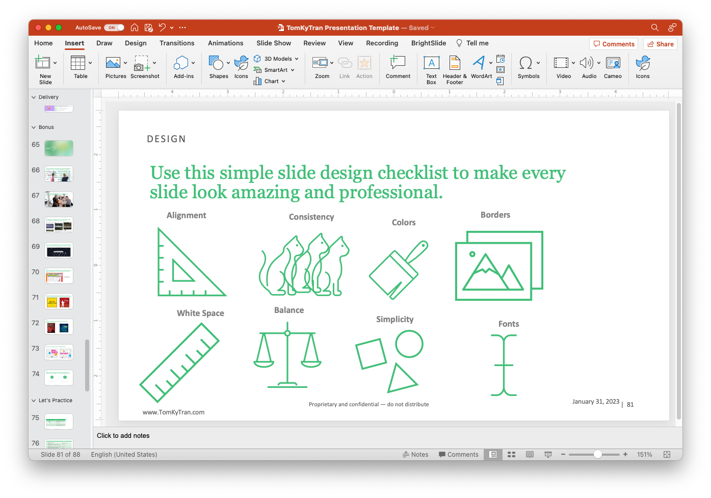
Step 1: Draw a table
Go to Insert on the Ribbon, Select Table, and Choose 4x2.
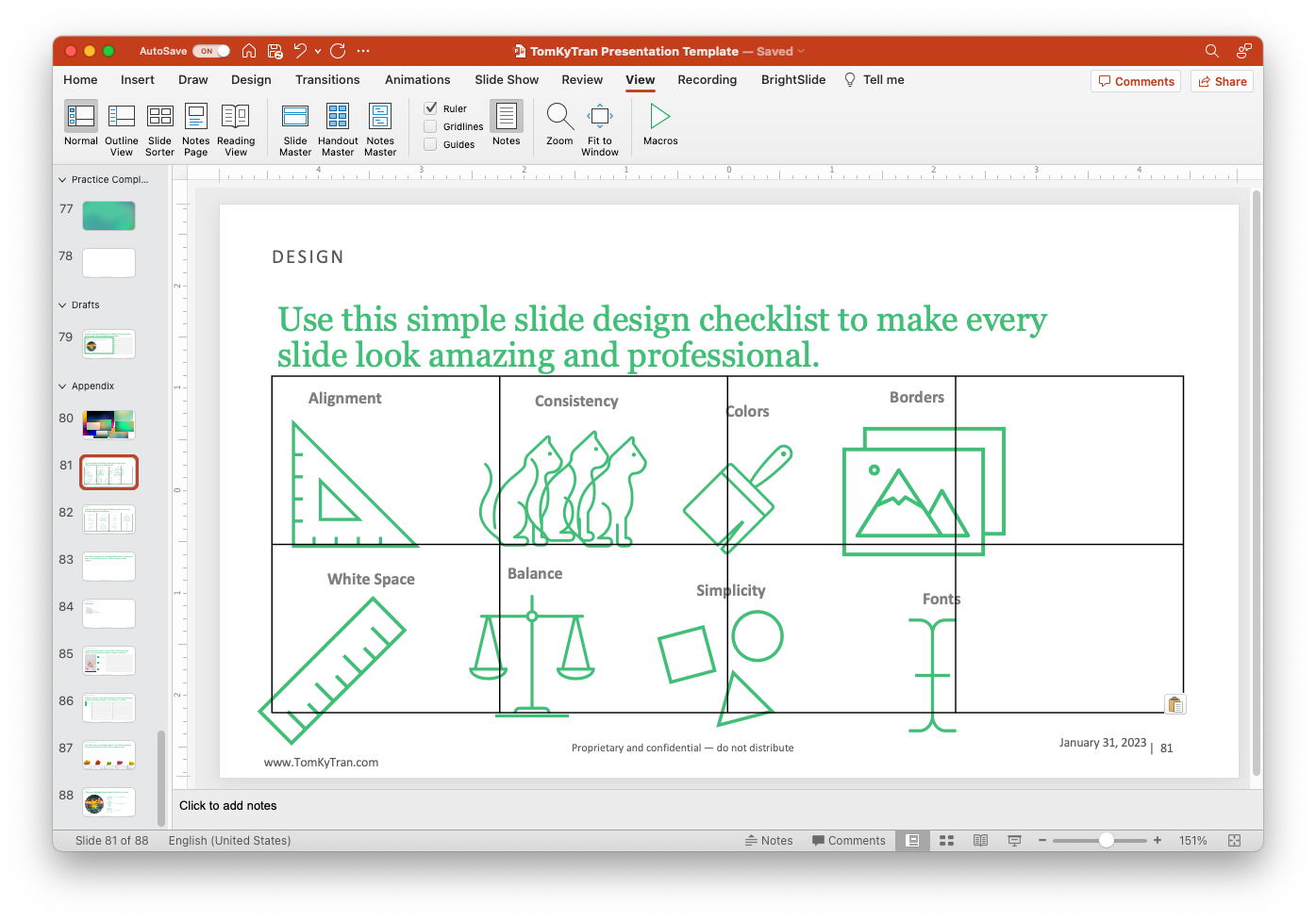
You can see the literal table on the slide. you should think of every slide as a table.
Just draw a table so that you can use the evenly spaced lines to help you arrange and align elements on your slide.
Step 2: Line 'em up
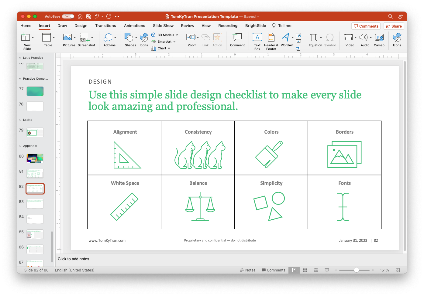
Now, just move the text around so that it is aligned within your table.
The reason you do this is that the table provides the underlying structure that helps keep the slide looking clean and organized.
Step 3: Delete the table
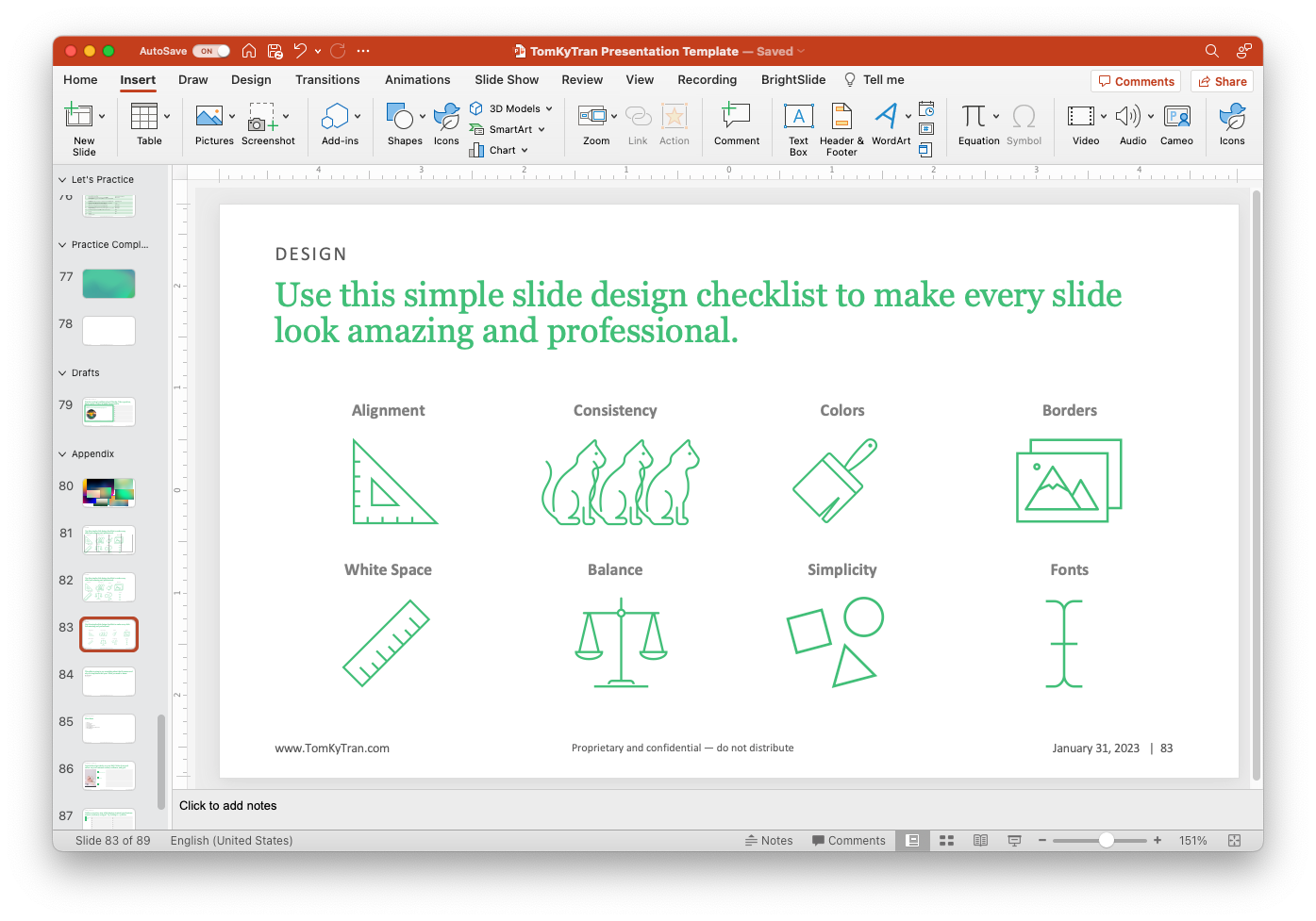
Bye-bye 4x2 table. Hello, pretty slide.
Compare the before and after:
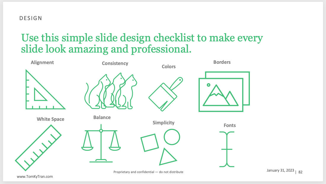
versus
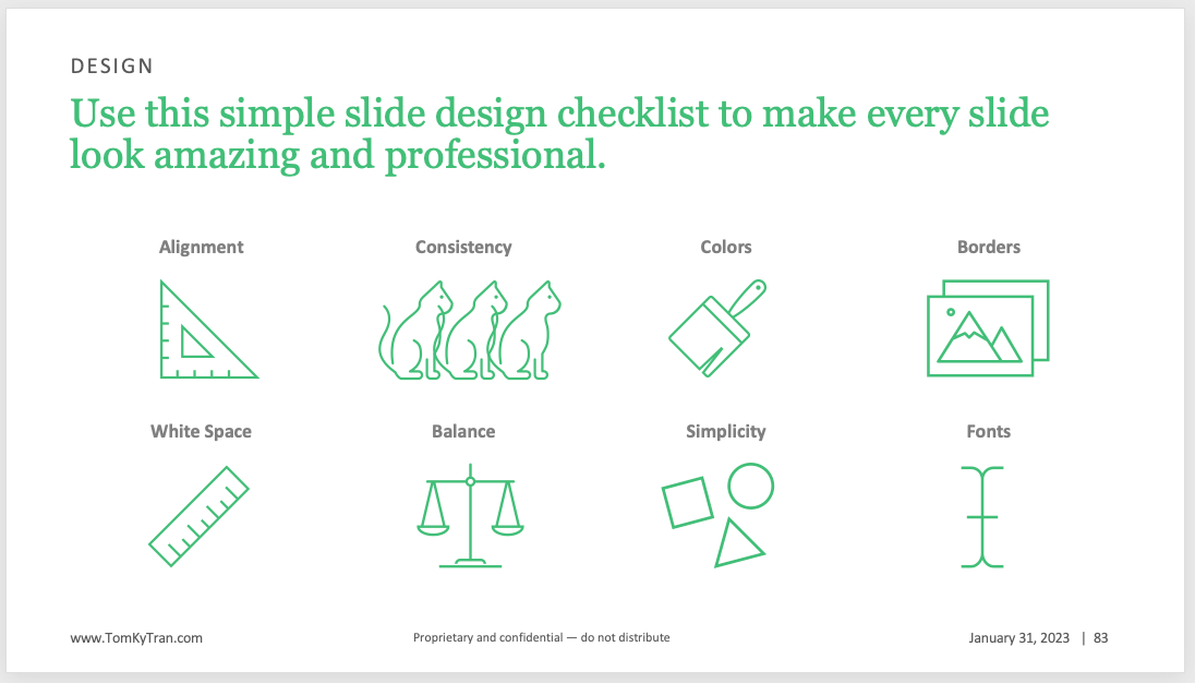
What a difference, right?
Conclusion
The big idea here is that you should be using a table to help you align all the elements on your slide, whether its text, images, charts, or pictures. Literally anything and everything.
You can be flexible and use a table that works for you. Maybe that's a table with two columns and one row. Or a 3x3 table. Find what works for your particular slide.
If you want to get more advanced, then PowerPoint has the option to show gridlines and guides under View.

Even though I know it's there, I always draw a table first. Move things around so that it's aligned. Then delete the table.
Was this tip helpful? Let me know!


