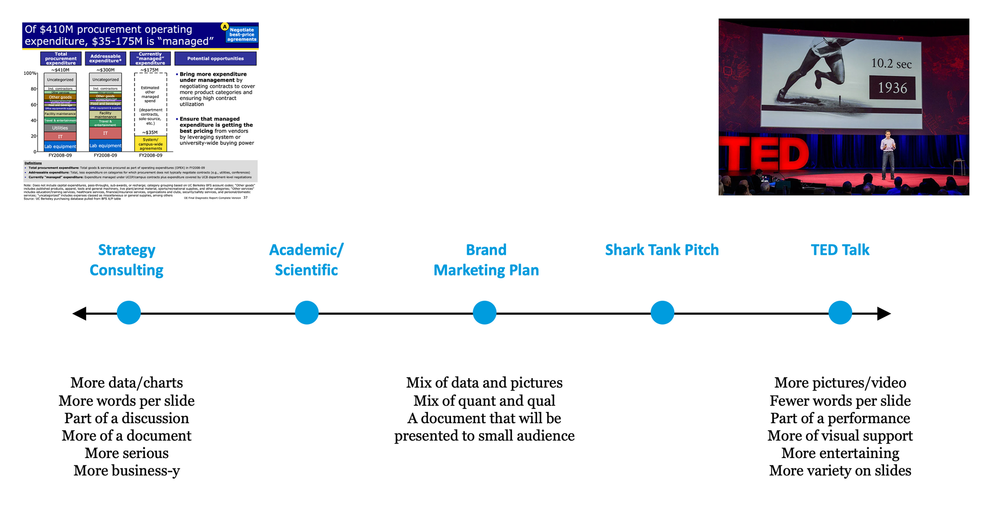
There are two presentation archetypes that can be put on a spectrum. In my career, I've had the chance to work on both kinds. However, it was only later in my career that I started to recognize the patterns. Once you know which one you are working towards, it becomes much easier to design and create.
The 2 Presentation Archetypes

Before I begin working on any presentation, I think about how it is going to be ultimately delivered. That is going to determine the kind of presentation I'll build.
99% of the presentations I create today are actually more business documents rather than something that will be delivered on stage in front of an audience. Usually, they will be sent out as a pre-read PDF the day before the meeting, projected on a big 86 inch TV in conference room during the meeting with hard copies handed out so everyone in the room can take notes and follow along. This kind of presentation has a certain kind of look and feel closer to the consulting style rather than the TED talk style.
I've found that brand management presentations (from a 5 year strategic plan to the weekly consumption deck) are somewhat of a blend of the two archtypes. They are not as text heavy as some consulting slides and often have much more visuals illustrating what the brand is trying to do. Of course, it can vary depending on the goal for the presentation and the audience. A presentation about social strategy is going to have a lot more pictures of influencers and the type of content that they've produced compared to a presentation about an Mixed Media Model (MMM) study.
Recently, I had the opportunity to design a presentation that was delivered on stage, by an executive, to an audience of 200-300 folks across the company. While it had the look and feel of a brand management presentation, I actually wish I'd gone further into the "TED Talk" side of the spectrum for the overall look and feel. I'm still proud of the presentation we created, but reflecting on the way it was delivered I think we could have cut down the text and increased the use of video and images to make the overall session more impactful and memorable.
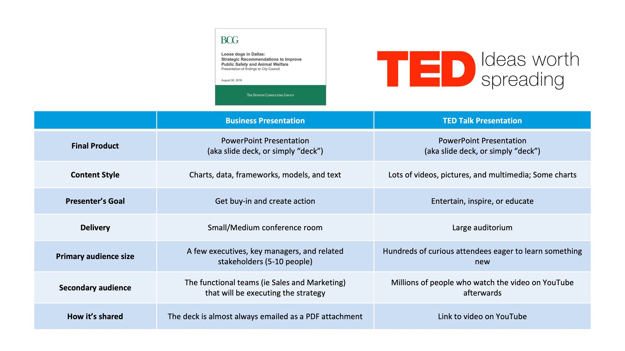
Differences in detail

Conclusion
There's a lot to learn from how management consultants and TED speakers design and communicate their insights. Knowing where your presentation falls on the spectrum and then looking at some of the best-of-the-best slide decks from either archetype will help you create your own compelling and pursuasive presentation!
What kind of presentations are you working on these days?


